Navigation Update
Project Context
Timeline: 14 months
Team: Product Designer/User Experience Designer (myself), Studio GM, Senior Product Manager, Front End Engineer, Studio Senior Producer, QA Lead
Brief: Modernize & create less friction for user navigation.
Constraints: Risking user retention due to an update in navigation; validation of the product update would roll out over a year after sufficient data is collected.
About
The live app life-cycle for TAP Sports Baseball (TSB) Mobile would see the addition of 5-9 new products annually. This game transformed over the course of a few years as I helped design many new features. As such, the young game became an elder game, with complex depth and a core loop that was becoming less apparent.
Background
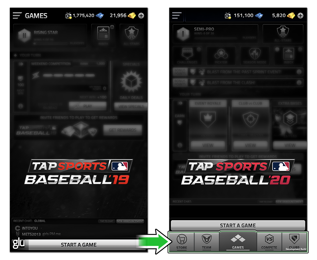
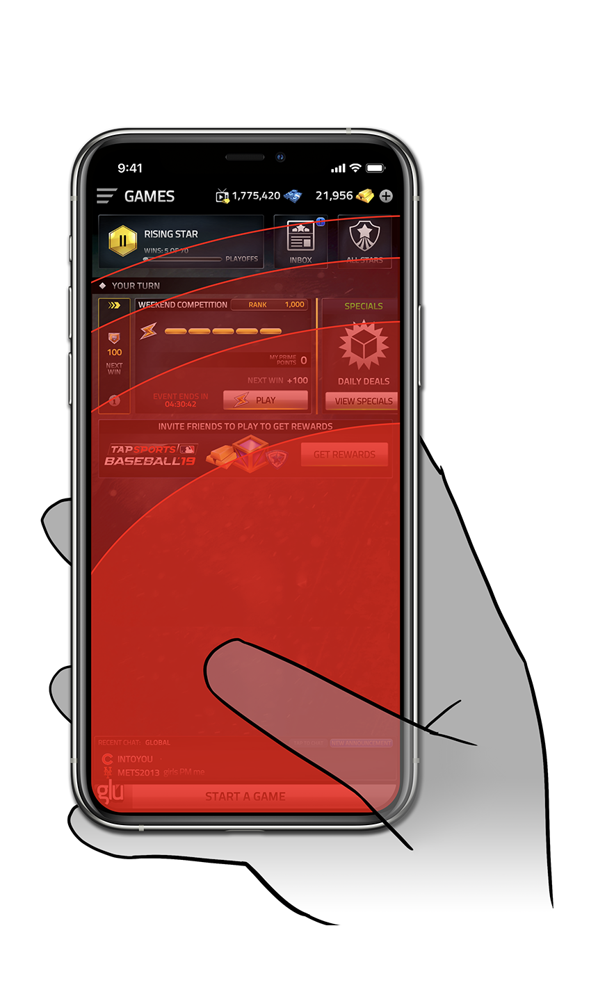
The menu button, like most apps, allowed access to all products within the app. Previous phone sizes had allowed users to access the menu with a simple reach of the thumb to the top corner. With the introduction of the iPhone X and subsequent other makes and models; the standard top left navigation menu would ultimately prove to be a poor user experience.
Objective
Redesign the menu system to make for an effortless user experience and allow for future scalable design.
User Research
Utilizing our internal community leaders and user click-rate data, we identified the habits and behaviors of users in the app; a key focus was on the spenders and their daily journey. This information ultimately helped determine how best to redesign without disruption and gave us additional key objectives to focus our efforts on; maintain the users path for spending and re-simplify the core loop. From testing, we also confirmed users would either;
Use a second hand to tap the menu
Utilized a additional swipe interaction to bring menu button in range to tap
Disengage with the app
Process specifics
Items identified as areas of focus included;
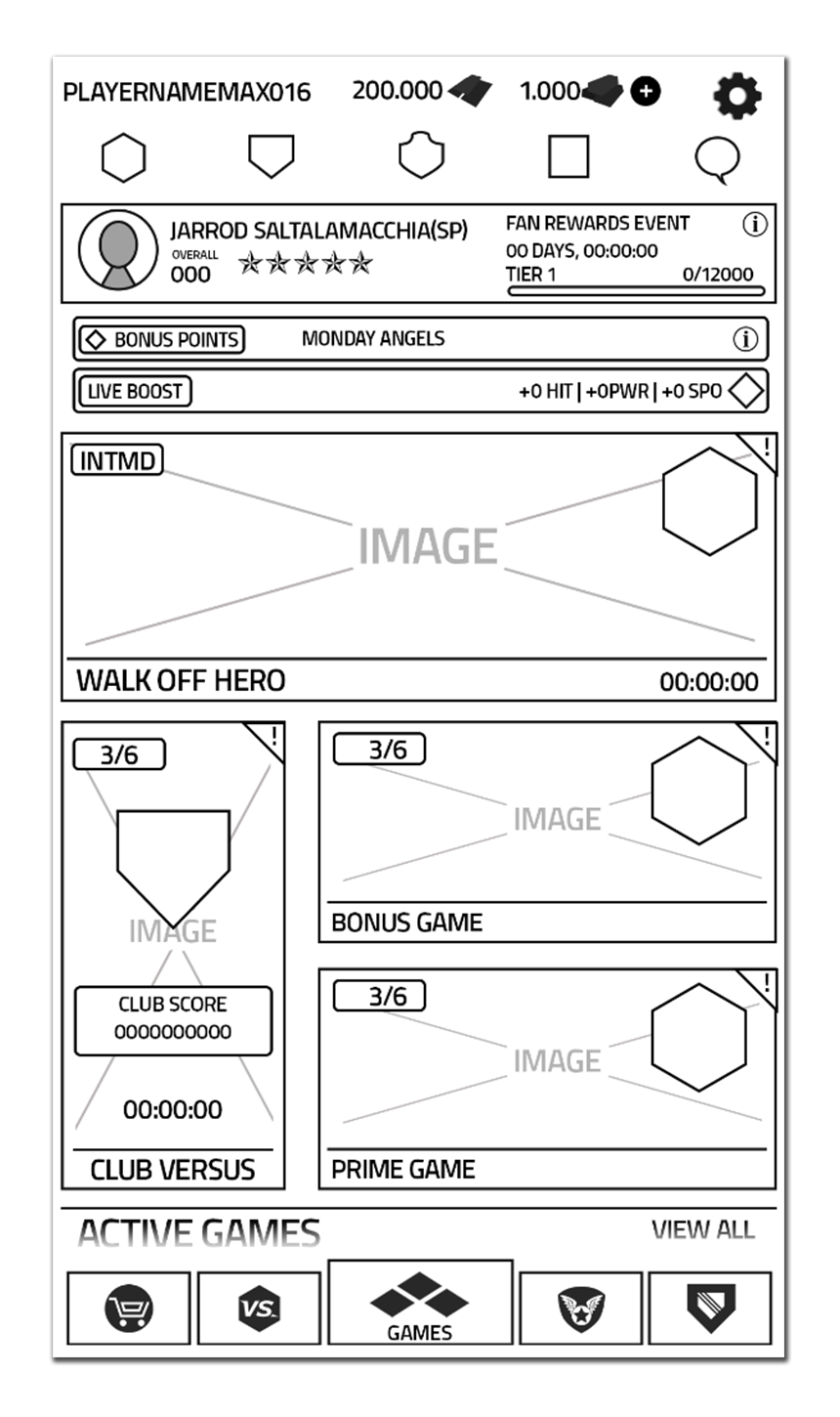
An architectural overhaul for products located in the current menu structure
Ensuring the context of the first time user experience (FTUE) remains valid
Constructing a new light design by partnering closely with engineers to minimizing the workload impact
Impact
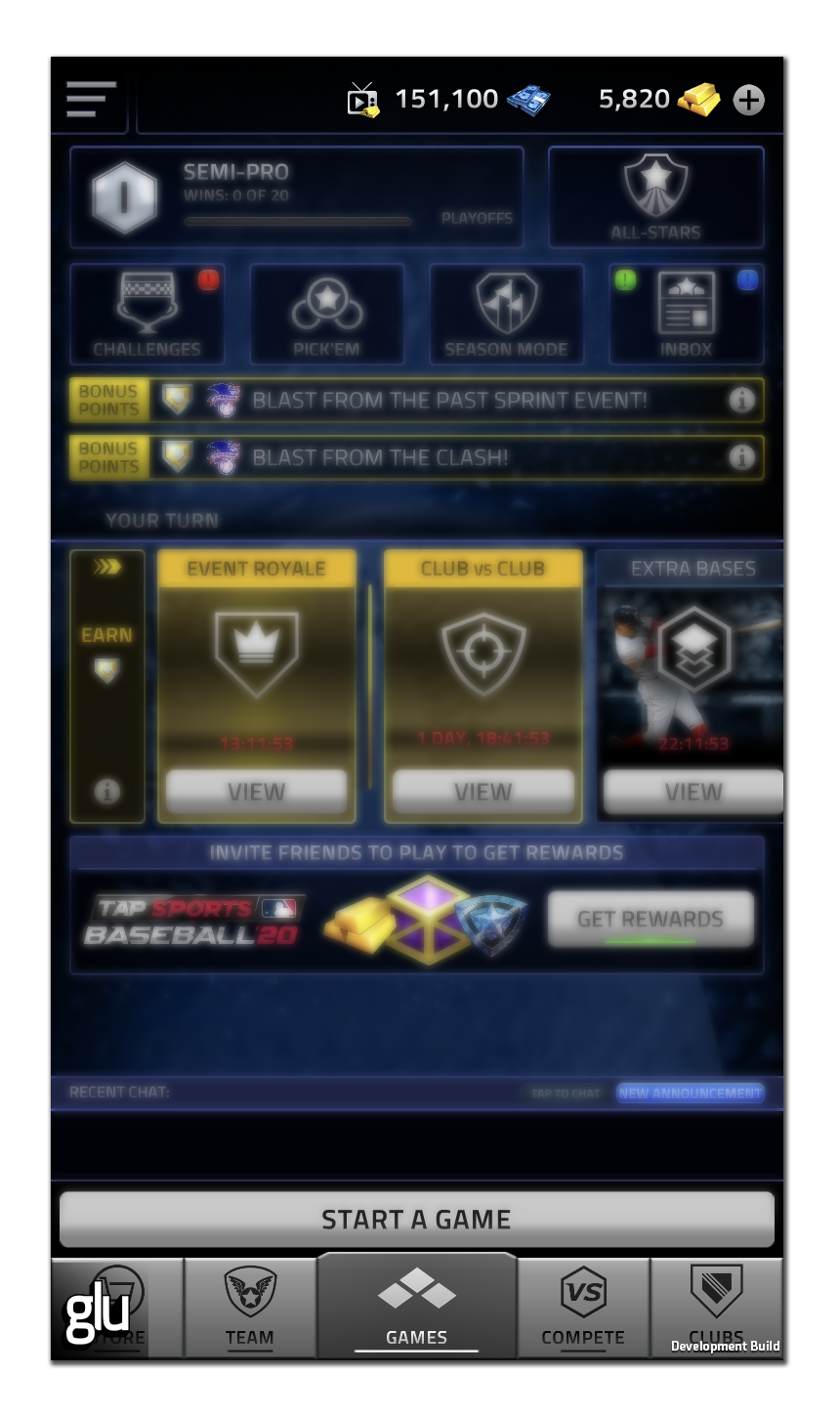
After we redesigned the menu system, the core navigational user experience was reduced by one click and guaranteed casual one-handed play. We also found returning users explored and deviated from their subconsciously predefined navigation patterns as new content surfaced more easily. Lastly the design proved to be scalable as the new architecture of the app allowed for effortless addition of new products.


