game Dashboard
Project Context
Timeline: 4 months
Team: Product Designer/User Experience Designer (myself), Senior Product Manager, Front End Engineer, Backend Engineer, Producer, QA Lead
Brief: Engage users with appropriate active content, reduce overwhelming scale of game & create a scalable product.
Constraints: First Time User Experience (FTUE) required re-engineering, re-designing the screen architecture, & a new simple visual language are required.
ABOUT
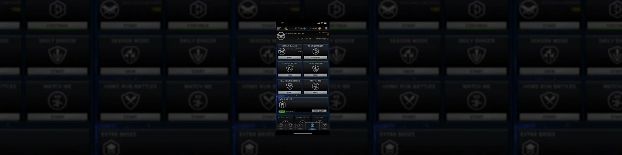
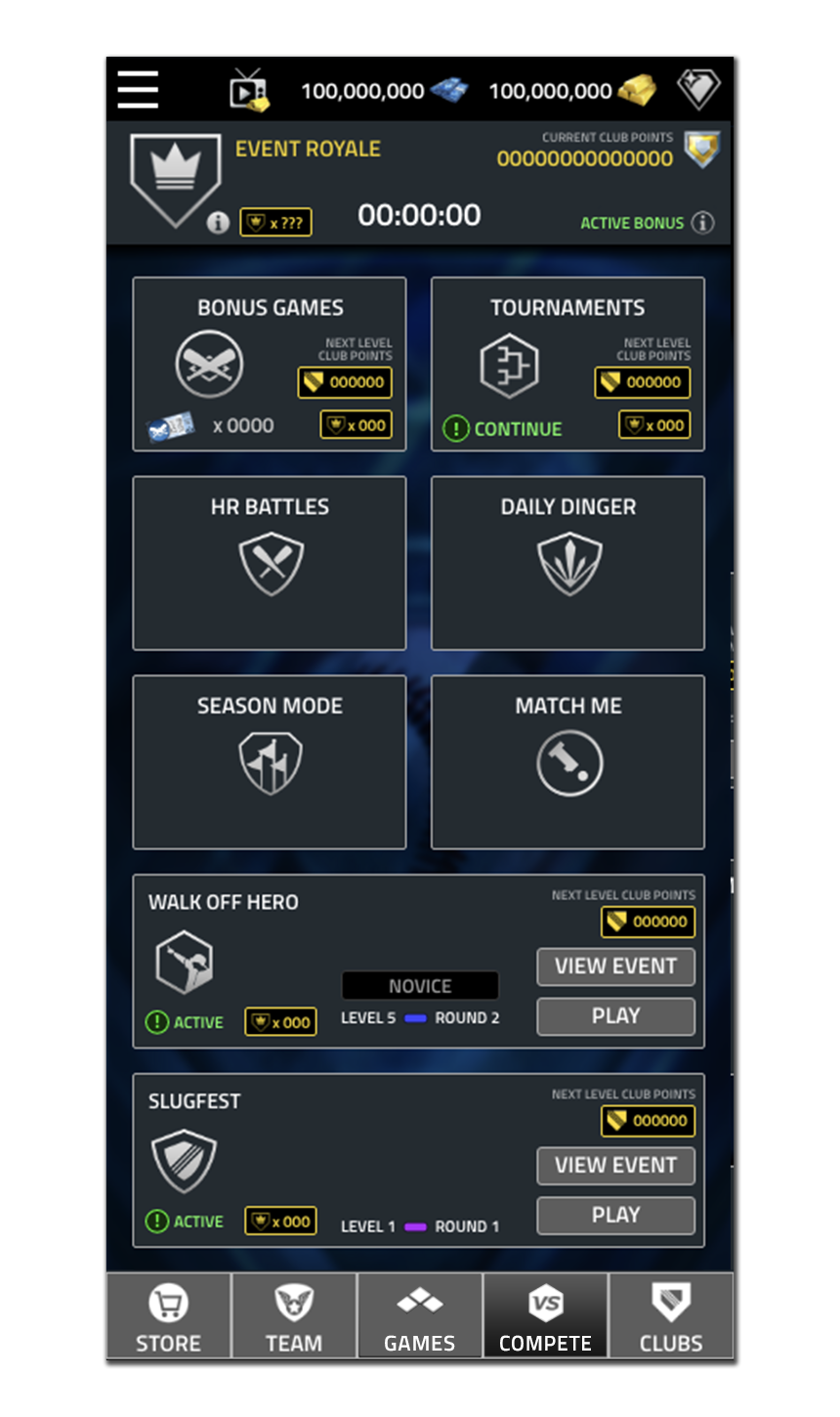
Tap Sports Baseball (TSB) would see the addition of a number of new product features through its annual production cycle. As a result by 2021 the sheer quantity of product features and game modes imbedded in the original design system made for a complex user experience.
BACKGROUND
TSB entered the mobile market gaming space with only one game mode. Over the course of time, I had the pleasure to help build out the product which grew to have over 13 game modes and numerous product features. Advocating for a positive user experience and scaleable design I prioritized the redesign of the game screen.
OBJECTIVE
Redesign the game screen to make for an engaging and simple user experience. Additionally, focus on scalable design to allow for future content and product growth.

USER RESEARCH
Utilizing our internal community leaders and user analytics, we identified the habits and behaviors of users in the app. Distilling the journey of the three user types (new user, casual user, deep user) helped identify commonalities as well as outlying factors (like the FTUE) when determining the right solution.


PROCESS SPECIFICS
Items identified as areas of focus:
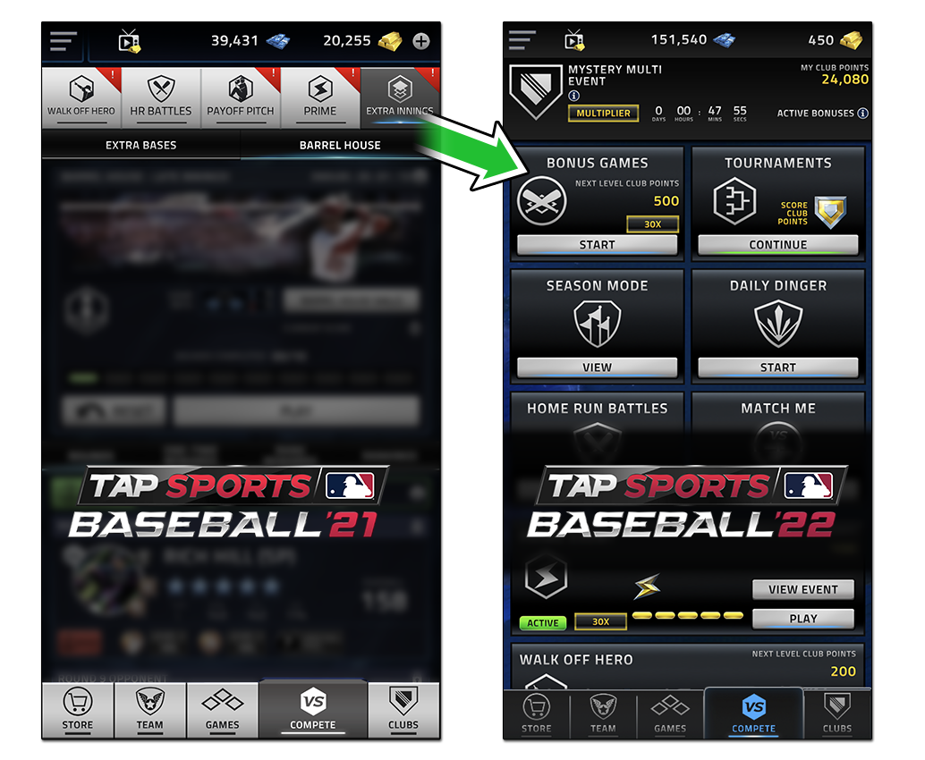
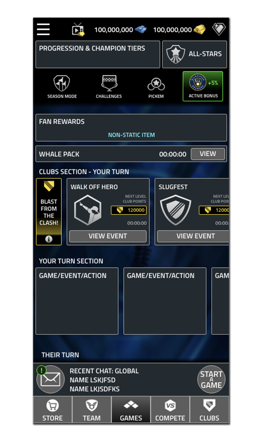
Architectural redesign - An architectural overhaul for products located in the game screen structure
Secure FTUE - Ensuring the context of the first time user experience (FTUE) remains valid
Visual language - Create clear visual distinctions for each products’ entry point
Scale - Focus on scaleable design systems to ensure no future issues
Logical layout - Define logic for sorting & connect the visual language to hierarchy of priority
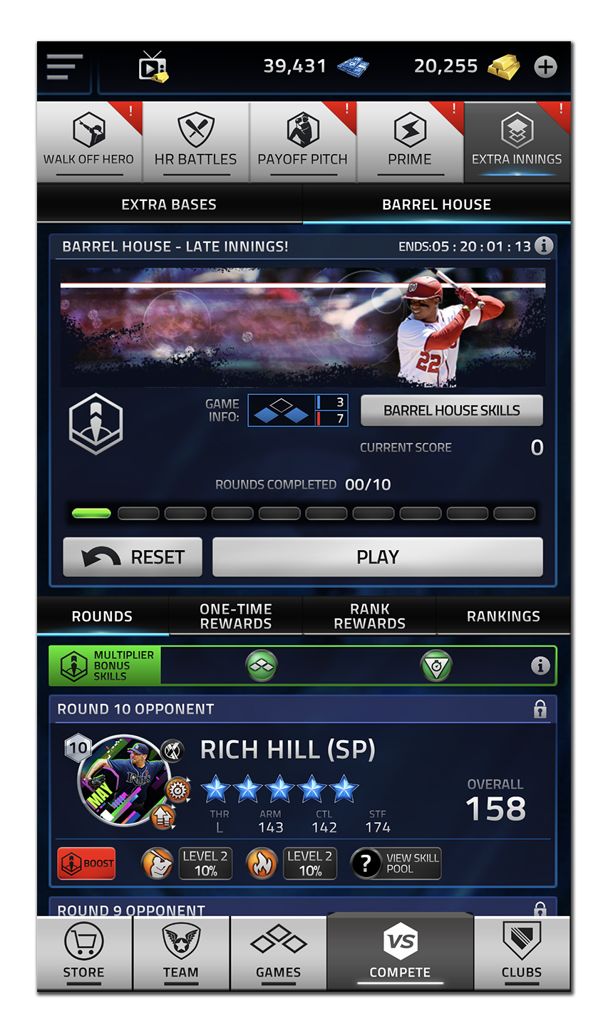
The project scope required a MVP initial design with a second pass scoped out to include things to make each panel more unique while still working in the confines of the modular design and additional custom artwork.
IMPACT
After redesigning the games screen, the core loop for users became very clear. The scaleable system proved to have the largest impact as new product were nearly fully code-driven. The dashboard design also removed the lengthy discussions around user visibility on new products as these products were all front and center. Another benefit was that each game mode now could showcase more information rather than navigational elements for other game modes. Lastly, we found that users could now explore other game modes more readily as all the content was in one place. They made sense of competitive timelines as the design included the upcoming date/time for release.


